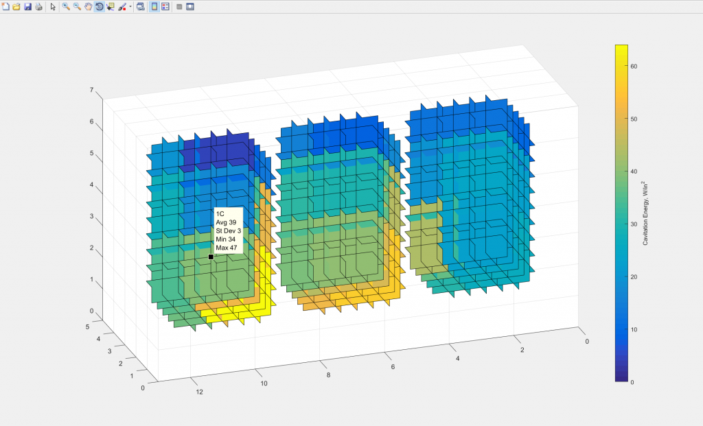
This quick coding project was based on a need to be able to quickly visualize and communicate 4-dimensional data. This script was developed for a work project, so I am not able to share many of the details behind the context of the data being visualized. The idea is simple, however. If every point in three-dimensional space has a certain value (for example, temperature or humidity), the tool may be used to visualize the distribution and spatial arrangement of those values.
The script developed was for a single use, so unfortunately it is not very portable. However, it can be modified to accommodate different spatial geometries and data sets.
The script takes advantage of MATLAB’s “slice” function (https://www.mathworks.com/help/matlab/ref/slice.html), which is commonly used for visualizing the surface of a 3-dimensional function.
The data collected on the 3-D space is pasted directly into the code, with an average, standard deviation, minimum, and maximum identified for each point. The data is then reformatted to make it friendly for the slice function. The slice function receives the x spatial points for the first container, the y spatial points, the z spatial points, the average data points for these spatial points, and the assigned slicing vectors (the vectors that determine where the “slices” are formed). The other two containers are then added on by holding on the figure. A custom tool tip function was also created to allow a user to select data points in the visualization to be able to identify the average, standard deviation, minimum, and maximum for that point.
The result of the script is shown below, where the tool tip is used to identify the spatial point with the highest data point.

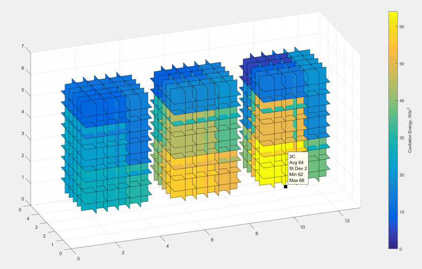
Using the “Rotate 3D” tool, the visualization may also be freely rotated to be able to view the data from other angles, allowing for quick analysis and qualitative understanding of the distribution of the data. The view below is the same set of data viewed from the opposite side.

This project allowed for effective and intuitive communication of the data collected, and even allows for qualitative and quantitative comparison of the outputs of different pieces of equipment and different settings on that equipment.
Note: I do not claim any intellectual property rights on the visualization developed. If you are interested in developing a similar visualization and would like to review my code, please reach out to me!

